Telescope

Project Summary
What is it?
- Telescope is a trend discovery tool developed by a content marketing startup
- Designed to give the company's editors the edge in trend discovery and research
- Proprietary technology planned to be sold as SAAS in the future
Key achievements:
- Realised a search data visualisation tool from initial research, through sketches to fully specified feature READ MORE >>
- UI redesign of platform READ MORE >>
- Revised and updated the processes for design communication within the team by implementing a pattern library and Zeplin to hand off designs
My overall responsibilities:
- End to end UX and UI of the product
- Working closely with developers (distributed team) in an Agile environment to deliver high quality, accurate designs
- Delivering timely and smooth transitions from ideation to production
- Proactive championing of the user within the team and throughout the business
- Writing clear, detailed and comprehensive functional specifications
Project team:
1 UX/UI designer (me)
1 lead engineer
4 remote developers
Case Study
Green Park Content are a content marketing company based in London, with offices in USA, Brazil, Argentina, Indonesia & Russia. Their clients include Unilever, Danone & Admiral Insurance. I was hired in August 2017 to work on Telescope, a content and trend discovery tool designed to help the content creators and editors within the company find inspiration for what to write about by gaining insight into how articles are performing on a variety of social media networks.
As the sole UX designer at Green Park Content I would take ownership of all aspects of the user experience of the product by designing new features, gaining feedback from the users by both interviewing them and observing them interacting with the tool, and implementing new processes to streamline the workflow of the team.
Included below is some insight into my most significant achievements within the role. Chronologically, the UI redesign occured before the development of the search visualisation tool, however the UI redesign also shows streamlining of the internal processes within my team, so I wanted to focus on the UX first and foremost.
Search Visualisation Tool
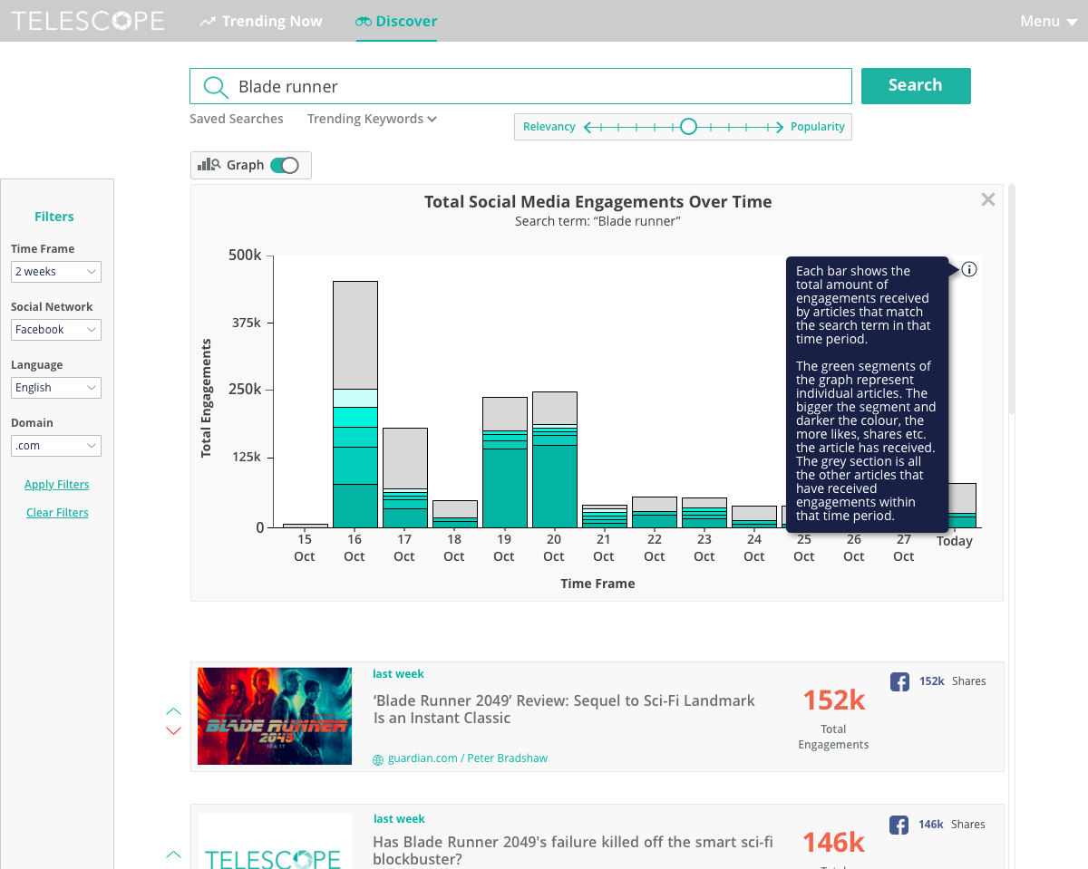
After the core functionality of Telescope was running and stable, I started to think about different ways in which we might leverage the data within the database in order to provide more insight to the user. At present, the tool would show results ranked by social media engagements within the time frame selected in the filter bar. A theme that cropped up several times in talking with the editors however was understanding how a topic is performing over time. Visualisation of data can be an incredibly powerful tool for conveying information quickly and clearly so I started to research how this might take shape within Telescope.
After doing some research, I found good examples of different ways to present this kind of data in graphs within the stats area in SoundCloud Pro, as well as a suite of analysis tools within Buzzsumo (ostensibly a competitor, had Telescope been available to the public).
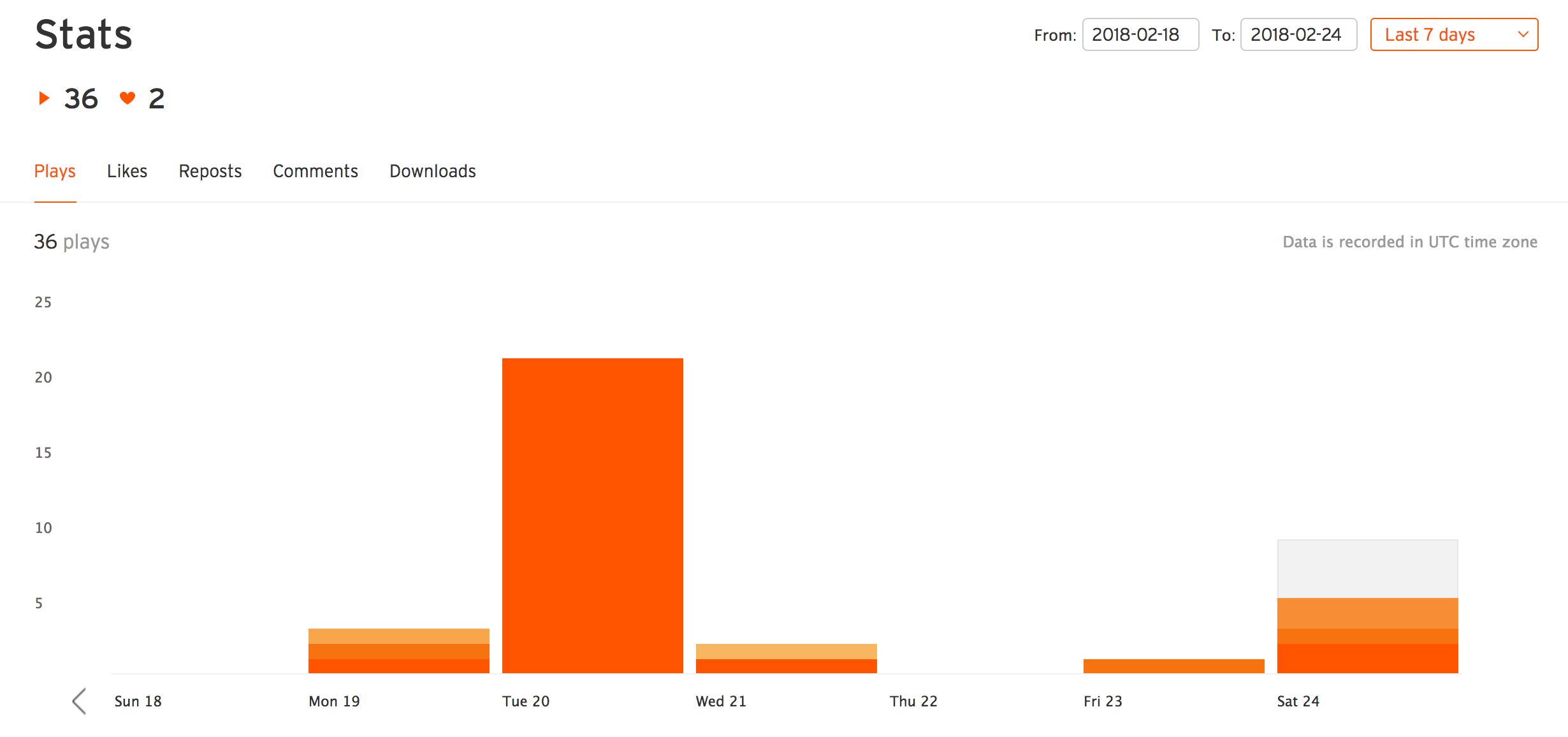
SoundCloud Pro stats graph
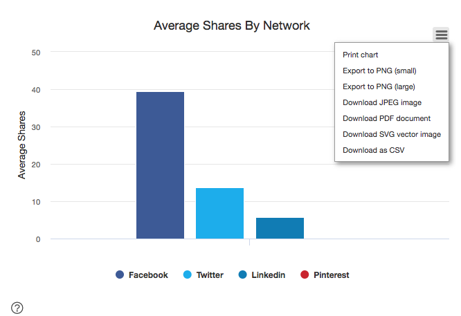
Buzzsumo analytics suite graph
I decided on designing a graph tool that would visualise a search made by the user in a date histogram, allowing them to quickly see the cumulated social media performance of the search term over a selected time frame. A major need of our users is to validate that they are writing about the right thing, so combined with a tool like Google Trends (which shows popularity of searches but not social media engagement), this graph would give our users a clear sense of how a particular topic is performing over time.
The bars of the graph would be split into a number of segments, with each segment representing an article, and these would be clickable allowing the user to identify specific, highly engaged-with content. Using the qualitative data from the user research I began to hand sketch and iterate how the tool might look.
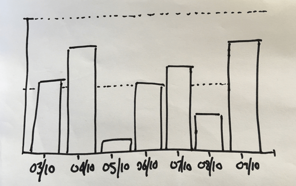
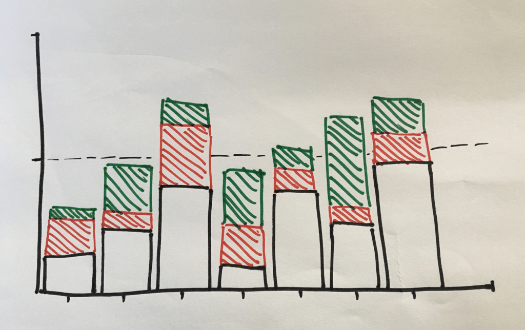
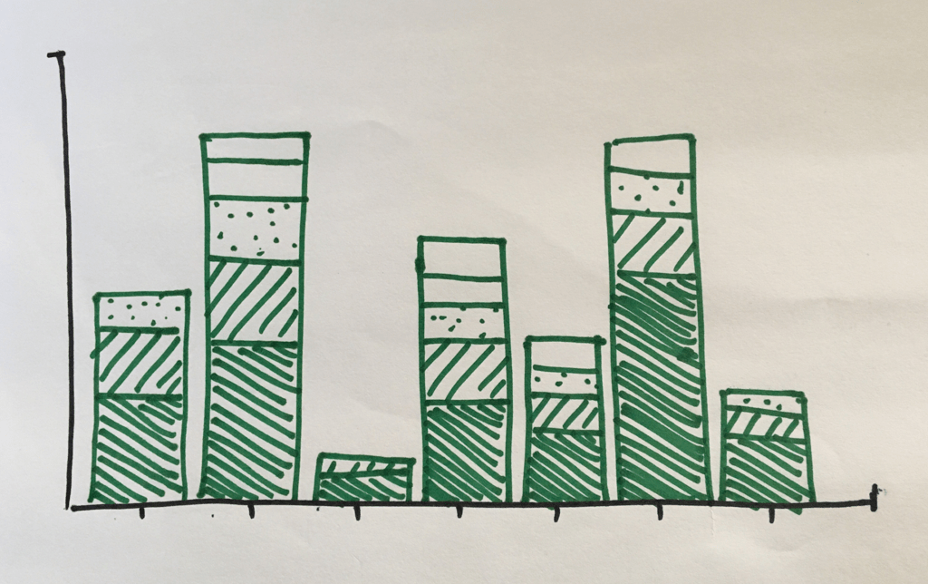
Sketches
Once I moved into making lo-fi digital wireframes, I scheduled a call with the PO and the developers to discuss the feasibility of the design and have them flag any particular technical challenges. I was pleased to hear at this stage that they didn’t foresee any major issues with my ideas for the feature, so I was then free to press on and do a more in depth exploration of how the feature would work.
Lo-fi digital wireframes
At this stage some technical challenges presented themselves:
a) How would the tool behave depending on the different time frames selected in the search filter bar?
b) Would the planned visual presentation make sense with a very high volume of search results?
I took the different time frames that the user can select in the filter bar and translated these into a series of ‘buckets’, which would represent bars on the graph along the X axis. For example, one week splits into 7 one-day buckets, 24 hours splits into 12 two-hour buckets etc:
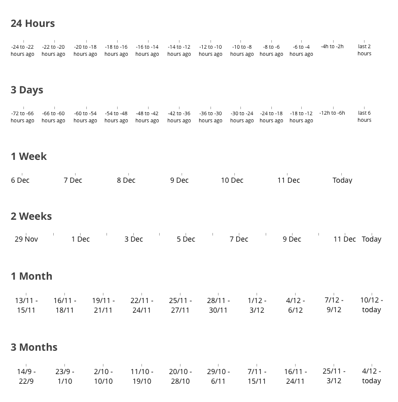
Timescale 'buckets'
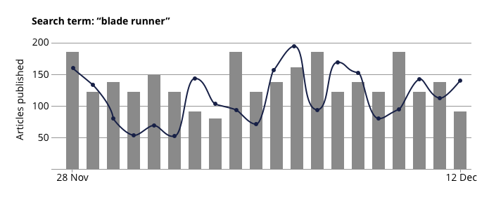
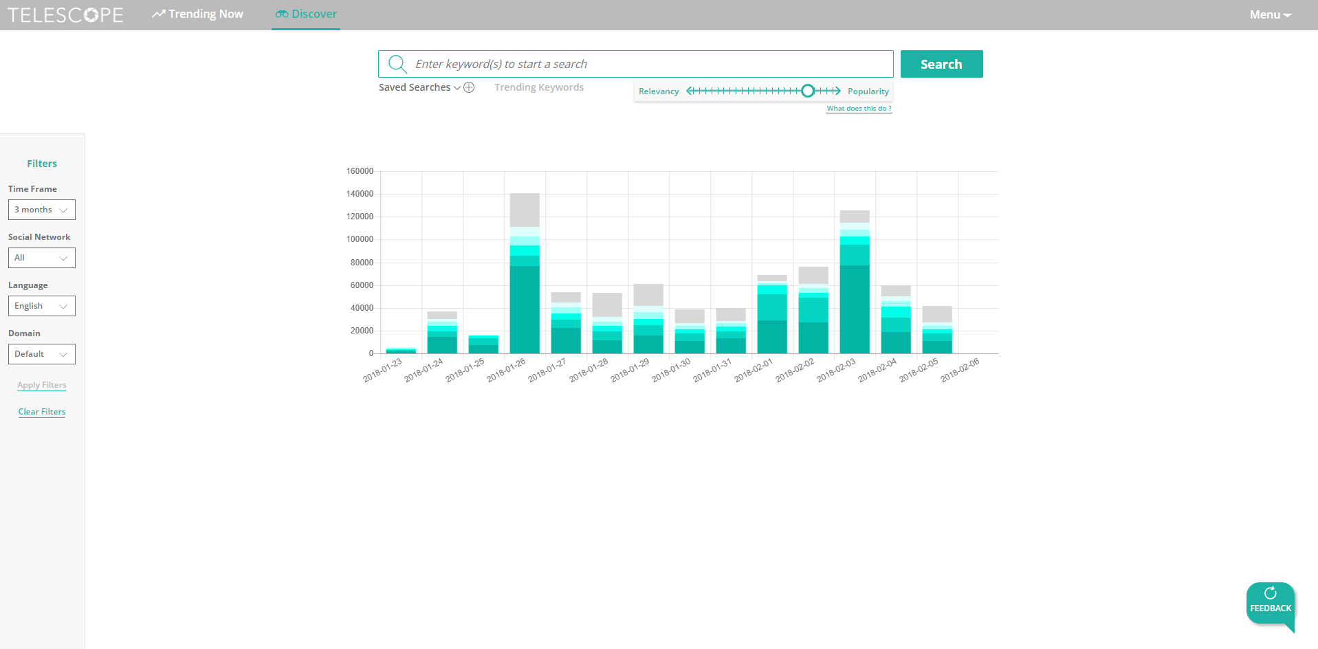
My next step was to mock up versions of the graph populated with real data from the Telescope database. I chose search terms of varying popularity in order to stress test the designs against a variety of search scenarios, then queried the database using Kibana to extract the figures I needed.
Doing this brought into focus an issue of scale. The scale of the Y axis would be determined by the bucket with the most cumulated social media engagements within it. If this number is very high, it will make the segments of the articles represented on the graph with few engagements appear very small in comparison; too small to be visible and/or practically clickable when the graph is rendered. My solution for this issue was to have a rule for the minimum amount of engagements an article needs to have in order to be represented by a segment on the graph. If the article does not have enough engagements, then its total would be included in an ‘other’ category.
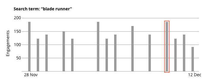
Once I had created a medium fidelity wireframe displaying real search data from the system, I put together a higher fidelity clickable prototype using InVision. This would allow me to both test a basic flow of the feature with users but also show the developers some of the more specific interactions intended for the tool. Insight from them at this stage of the process allowed me to make some minor compromises to the functional aesthetics of the design which would save them a lot of effort in coding the first working version of the feature.
Screen from prototype
After testing the prototype with some users and ironing out a few more details like the text within the tooltip, and once I had written a full, detailed specification of the feature, the developers were able to go ahead and start coding. This was the result, the fully coded graph tool populated with real data from the database:
Coded graph tool
UI Redesign / Pattern Library
When I started at Green Park Content, Telescope was in dire need of a visual overhaul. The colours were heavy and didn’t compliment each other, there was a lot of visual noise in the form of unecessary lines dividing elements and, despite there being a style guide to work from, most of the pop ups and overlays varied in styling leading to a distinct lack of visual cohesion across the site. Part of the problem also stemmed from the method of transmitting designs to the developers - wireframes would be ‘redlined’ by adding measurements to the sketch files. This is very time consuming, so many of the less important pop ups had simply been left unspecified and the developers threw them together as best they could.
My solution was to start with the Style Guide. Each of the different elements within the guide received a fresh look, starting with the colours, through primary navigation, buttons, pop ups, overlays, form fields and menus.
Next, I created symbols for all these elements and, depending on how they would behave when implemented in different designs, adjusted their resizing properties (this would allow me to reuse the same elements in wireframes and have them be quickly adjustable to new sizes and contexts).
This process included creating colour swatches for the brand colours of the site which were nested inside icons, buttons and other elements. This meant that they could be quickly added to a design, but if the brand colours of the site changed at a later date, all that would be needed is to change the relevant swatch in the master sketch file and the new colour would cascade throughout the Style Guide (and any other Sketch files using these symbols). Larger elements like whole pop ups and overlays were then constructed from nested symbols, making it very quick and easy to implement these in new designs.
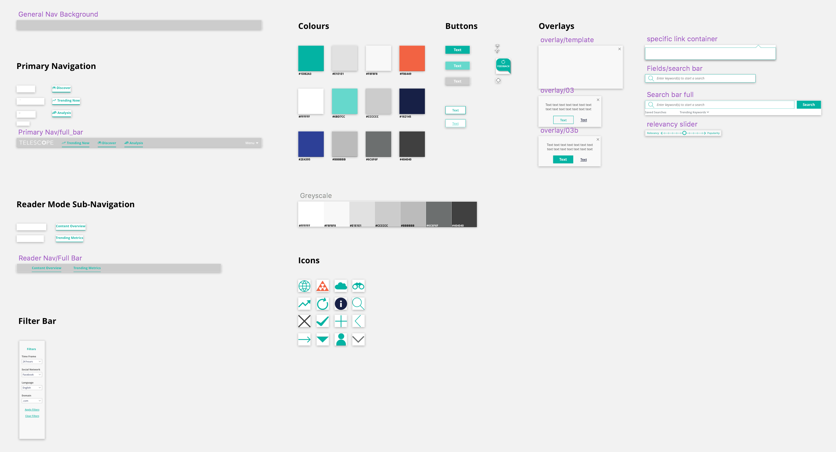
Pattern library
I then set the Sketch file for the Style Guide to be treated as a library within Sketch. This means the symbols contained within this document would be available to use on all new designs going forward, and any changes to the symbols within the master file would automatically propagate through all designs that use these symbols.
The final problem to solve was that of conveying the measurements of the designs to the developers. The currently used method of redlining the wireframes within Sketch, exporting them as images and keeping them within a shared folder structure was inefficient due to the manual nature of the process; there was a lot of scope for error when updating designs. To alleviate this issue I used Zeplin. Designs could be quickly exported to the software through a plugin for Sketch, and once inside, the measurements of the different elements of the design, as well as the colours and typefaces used, are available with no time consuming redlining necessary. As with the Sketch library file, updates to designs can be quickly and efficiently communicated to the developers, as all that is required is to re-export them to Zeplin and they are available immediately.
The results of this process were:
a) A refreshed, cohesive visual identity for the site
b) To greatly streamline the workflow of creating new wireframes or updating existing ones and then communicating these changes to the developers, creating a smooth transition from design to production.
Postscript: the benefits of the new approach became immediately apparent when researching web accessibility. Using a tool that checks the contrast ratio of a user defined group of colours (hexnaw.com), I realised that some of the brand colours chosen for the visual update would not be compliant with WCAG 2.0 accessibility guidelines. All that was then required was to amend the master Sketch file and the new colour scheme would be applied.