Hia Magazine
Digital Style Companion
World Vision Canada - UX Component Library

1/5
Setting
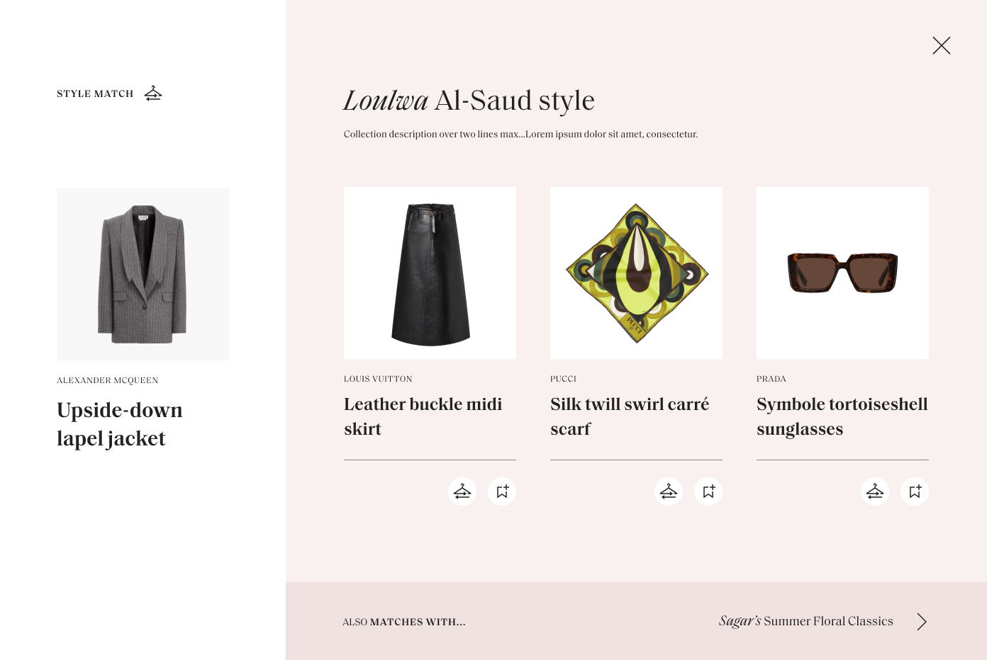
Hia Magazine, the leading high end fashion magazine in the Middle East, had hired Ostmodern to redesign their website. I joined the project later on, replacing the outgoing UX designer in a cross functional team. One of the final features to be added to the site was the Digital Style Companion, a feature explored in concepting and testing, but not fully specced or considered for the main site. The idea was to provide a tool for users to explore garment and accessory recommendations, harnessing the positioning and reputation of Hia Magazine as fashion industry experts.
2/5
Challenges & Objectives
The Hia team wanted to see what the appetite for a Digital Style Companion feature would be before fully committing to any tech integrations that would be costly to procure and implement. They posed the challenge of creating a kind of live prototype - faking the kind of feature that would usually use recommendation algorithms to do the heavy lifting - with the resources currently available within their CMS. Despite my recommendation that this be tested with a clickable prototype first they had already commited to some version of this feature internally, so we were to press ahead with designing an MVP for development.
3/5
Concepting
The value of this kind of feature has been generally validated by the existence of similar tools elsewhere, so to start I undertook a concepting exercise, thinking simultaneously about how to present information to the user and how this might practically work within their CMS. The core idea was to harness the experise of their editors to create style collections - lists of products related by a theme or aesthetic. I drew sketches to explore how these would be linked together in a way that allows users to go down a rabbit hole of discovery, following what products they enjoy to further items. I hypothesised that the personal aspect of editors creating this content could turn out to be an asset rather than a drawback, injecting a personal element lacking in content served by impersonal and often imprecise recommendation algorithms.
4/5
Client Feedback & UI Phase
Client feedback was very positive and they were impressed with my solution as a very resource light approach to faking the feature. After a couple of rounds of tweaking based on their feedback I collaborated with our UI designer to arrive at the final visual presentation, seen at the top of this page.
If I had more time to explore this feature in more detail, aside from the intial lo-fi prototyping and testing I mentioned earlier, I would have liked to flesh out a clearer idea of how we might go about navigating the transition from an editor input based approach to content grouping to one based on data and algorithms.
5/5
Results & Future Considerations
After launch, the business can use the feature to obtain qualiative and quantitative information to make an informed decision about whether they invest more time and money into it and fully flesh it out with the necessary tech integrations.